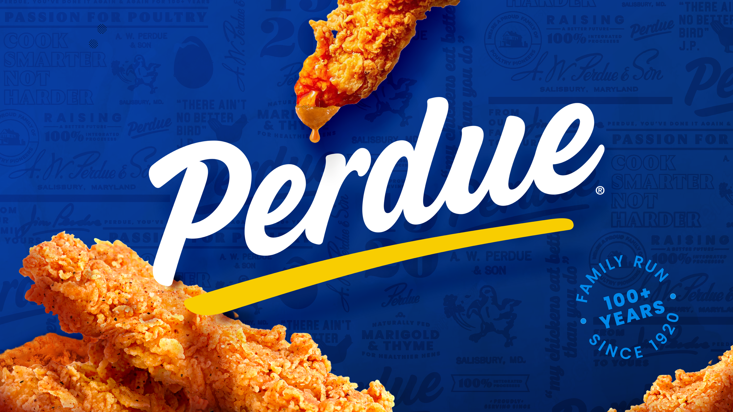
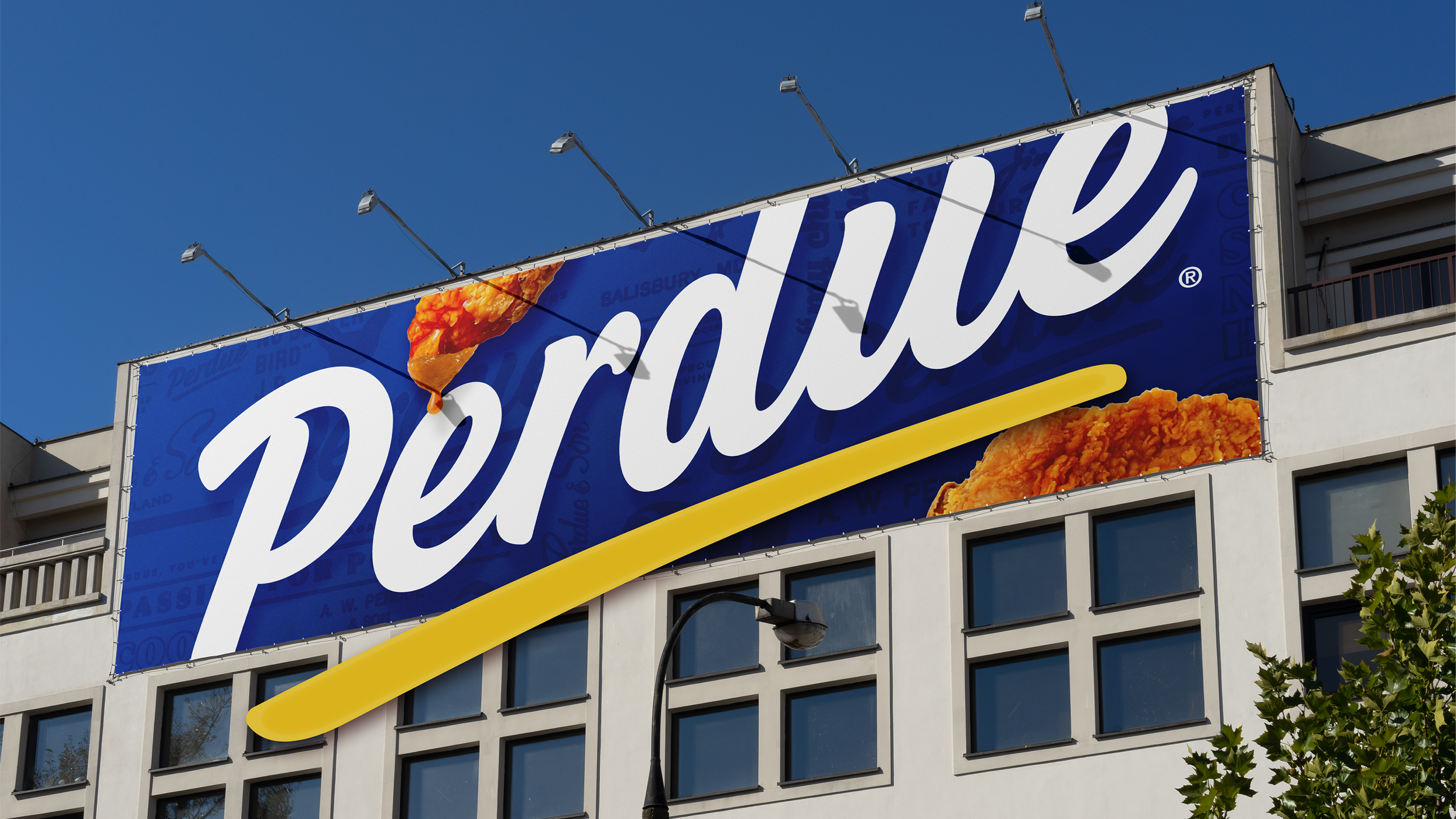
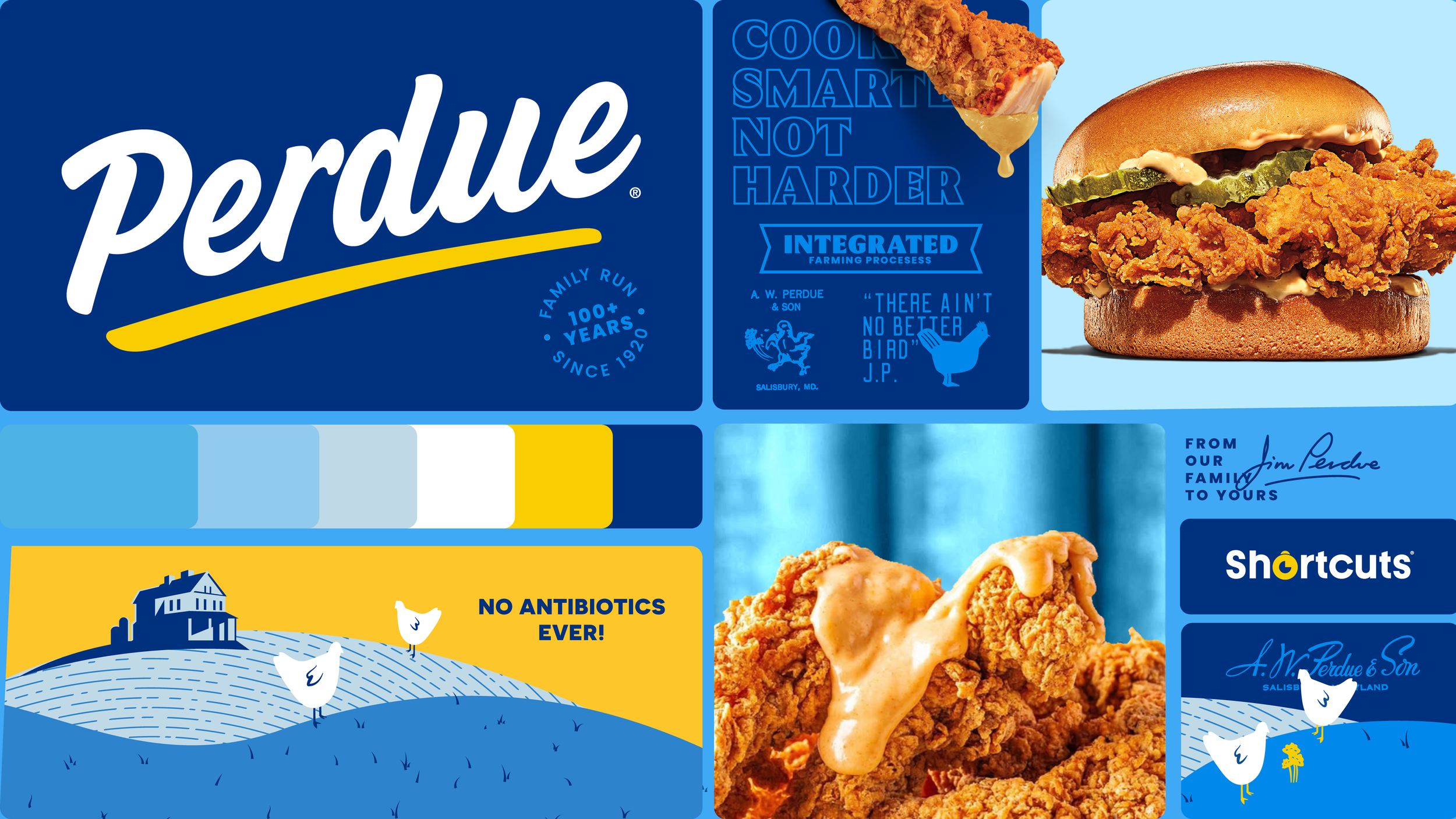
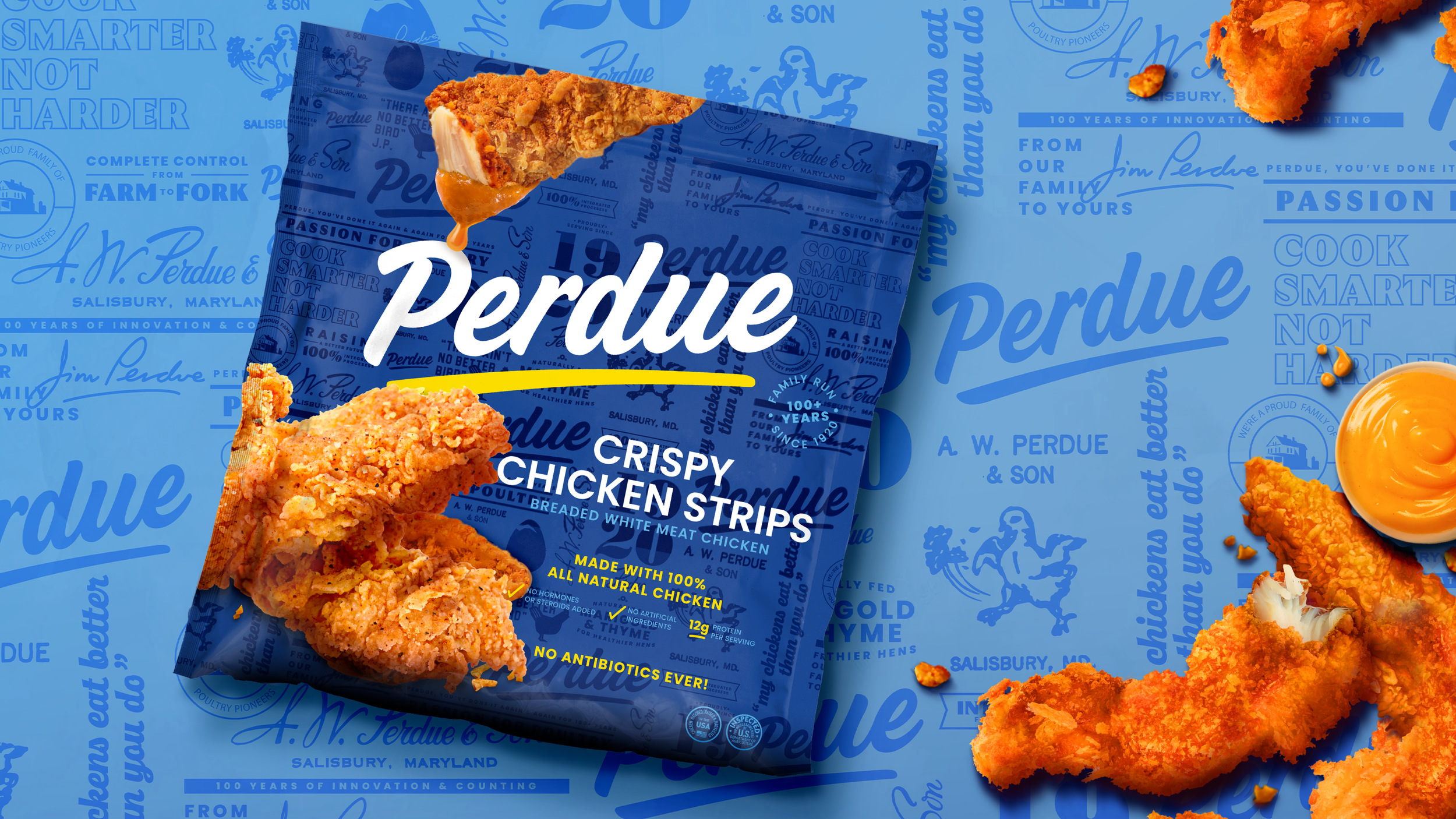
Perdue / A heritage refreshed for the next generation
Scope: Brand Redesign
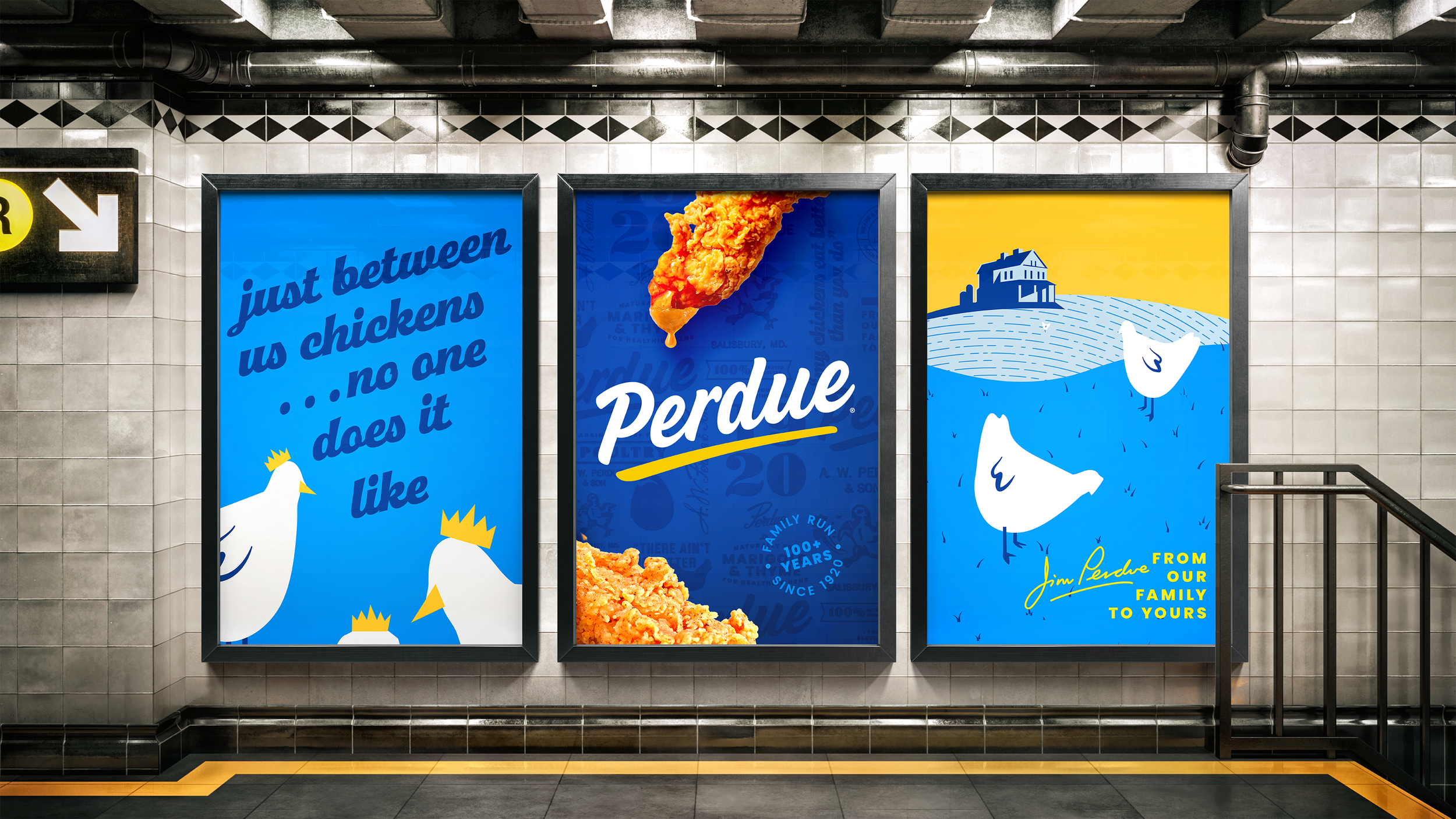
Role: Design Director & Relentless Defender of the Good Stuff
This wasn’t just a redesign—it was a two-year tug-of-war between legacy and modernity. I was part of an incredibly talented (& patient, as the client shifted) team that helped lead the charge from the ground up: from 5AM store walks to late-night strategy decks, keeping the team energized, the design voice intact, and the brand honest to its roots.
We gave Perdue a more signature logomark, a tone-of-voice-driven pattern pulled from historical documents, a richer, bolder color palette, and photography that felt more editorial than expected in the poultry aisle. Every element was built to signal leadership without shouting.
The process had ups and downs—some of them loud—but we fought to keep the design uncompromised, even when marketing pressure hit hard. In the end, we didn’t just rebrand Perdue. We helped them find their voice again.
This is Perdue: heritage-forward, unapologetically modern, and still leading the flock.
Note: This is a near-final concept from before release. While not the version currently in market, it reflects the original design intent—and includes a few personal tweaks since this isn’t the final client-approved work.


Agency: Pearlfisher
Hamish Campbell - Executive Creative Director
Matt Sia - Creative Director
Gabrielle Beck, Ryan Panchal, Yong Lee
Talia Evans - Strategist
Alexandra Moore- Client Director
Courtney Tight- Head of Client Management